
2026 Website Traffic Trends: Why Mobile Rules The Internet Now
Over the past decade, the way people access the internet has completely shifted, and 2026 is no exception. Mobile devices now dominate how we browse, shop, and engage online, leaving desktop usage trailing behind.
Whether you’re a business owner, marketer, or website creator, understanding the difference between mobile and desktop traffic is no longer optional, it’s critical to your success.
Below, we dive into the latest 2026 statistics on mobile vs. desktop website traffic and what this means for your digital strategy moving forward.
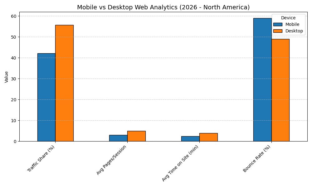
Mobile Vs. Desktop Website Breakdown
Traffic Share
- North America: As of early 2026, desktop has slightly overtaken mobile, making up about 55.8% of web traffic, with mobile at 42.2% and tablet under 2% .
- Global: Mobile dominates globally, making up around 60–64% of web traffic. North America remains more balanced due to workplace desktop usage .
Pages per Session
- Mobile: Average of ~3 pages per session
- Desktop: Average of 4–7 pages per session depending on the industry
Time on Site
- Mobile users typically spend 1.5–3.5 minutes per visit.
- Desktop users spend more time, 2.5–5 minutes, thanks to easier navigation, larger screens, and longer-form content.
Bounce Rate
- Mobile: Typically 58–60%
- Desktop: Around 48–50%, showing that desktop users are more likely to engage with more content
Conversion Behavior
- Desktop users convert at a higher rate. On average, desktop conversion rates are 2x higher than mobile, especially for high-ticket or complex purchases
Mobile vs. Desktop: Key Differences in Experience
When it comes to how users interact with websites, the experience between mobile and desktop is not the same, and businesses that don’t recognize these differences risk losing traffic, leads, and sales.
Here’s how mobile and desktop website experiences differ:
Screen Size & Responsiveness
Mobile devices have much smaller screens compared to desktops. That means websites need to be responsive, automatically adjusting layouts, text sizes, and images to fit smaller displays. A site that looks great on a desktop but forces mobile users to zoom, pinch, or scroll sideways can quickly frustrate visitors and drive them away.
Navigation (Menus, CTAs, Buttons)
Mobile navigation needs to be simple and thumb-friendly.
Drop-down menus, large clickable buttons, and minimal clutter are essential on mobile. On desktop, users have the luxury of using a mouse and seeing full menu bars at once, but on mobile, a confusing layout or tiny buttons can instantly kill engagement.
Loading Speeds
Speed matters everywhere, but it’s critical on mobile.
Mobile users are often on the go and expect near-instant loading. According to Google, 53% of mobile users abandon a site that takes longer than 3 seconds to load. Optimizing images, using clean code, and minimizing unnecessary scripts all help boost mobile load times.
Behaviour Differences (Scrolling Habits, Attention Span)
Mobile users typically have shorter attention spans and faster scrolling behaviors than desktop users.
They scan content quickly, often favouring short paragraphs, bulleted lists, and bold headlines. Desktop users are more likely to dive deeper into long-form content, but mobile users want fast, scannable information and clear next steps (like CTA buttons).

Why Having a Mobile-Friendly Website Is Critical in 2026
Should a website be mobile-friendly? Absolutely, now more than ever. In 2026, having a mobile-friendly website isn’t just a bonus; it’s a necessity if you want to stay competitive online.
Google Prioritizes Mobile-Friendly Sites
Google officially uses mobile-first indexing, which means it primarily crawls and ranks the mobile version of your site, not the desktop version.
If your site doesn’t perform well on mobile, it could directly hurt your SEO rankings, making it harder for potential customers to even find you.
Higher Bounce Rates for Non-Mobile Sites
Users expect a smooth, fast, and easy experience when browsing on their phones.
If your site isn’t optimized for mobile, meaning it’s slow, hard to navigate, or awkward to use – visitors are much more likely to bounce (leave without interacting). A high bounce rate sends a negative signal to Google, further damaging your SEO.
Mobile Experience Impacts Conversions
A bad mobile experience doesn’t just hurt your rankings, it hurts your bottom line.
Studies show that conversion rates are significantly higher on mobile-friendly websites compared to those that aren’t optimized. Clear CTAs, fast load speeds, and easy-to-use forms all contribute to turning visitors into leads or customers.
Mobile Friendliness Affects Your Paid Advertising
If you’re running Google Ads or social media ads, mobile optimization is crucial.
Google Ads, in particular, factors in your site’s mobile performance when determining your ad quality score, which impacts your cost-per-click (CPC) and ad placement.
A poor mobile experience can make your ads less effective and more expensive.

How to Make Your Website Mobile-Friendly
Making your website mobile-friendly doesn’t have to be overwhelming, but it does require thoughtful design and optimization. Here are the key elements to focus on:
Responsive Design
Your website should automatically adjust to fit any screen size, whether it’s a phone, tablet, or desktop. A responsive design ensures that layouts, images, and text adapt smoothly without forcing users to zoom or scroll awkwardly.
Fast Load Speeds
Speed is critical on mobile. Compress images, minimize code, and leverage caching to ensure your pages load quickly. Remember: users expect a site to load in under three seconds, anything longer and you risk losing them.
Easy Navigation for Thumbs
Mobile users navigate with their thumbs. Menus, buttons, and links need to be large enough to tap easily without frustration. Stick to simple, intuitive navigation that allows users to find what they need fast.
Clear Calls-to-Action (CTAs)
Make sure your CTAs (like “Book Now,” “Contact Us,” or “Get a Quote”) are highly visible, easy to tap, and placed strategically throughout your mobile site. Clear CTAs guide users toward taking action without confusion.

Creating A Mobile-First Website
The numbers for 2026 are clear: mobile dominates the web. With over 60% of website traffic now coming from mobile devices, having a site that’s not mobile-optimized means you’re leaving traffic, leads, and revenue on the table.
A fast, responsive, mobile-friendly website isn’t just a nice-to-have, it’s essential for reaching today’s audience, ranking well on Google, and converting visitors into customers.
If you’re ready to make sure your website is truly mobile-first (and set up for success), reach out to us today. Our team specializes in building mobile-optimized websites that drive results, and Cliniverse Sites gives clinics a done-for-you site that’s fast and mobile-first from day one.
Resources
Related Articles
 Get Found Online
Top 6 Free Marketing Analytic Tools For Your Website
Discover the top free marketing analytic tools you need to use for your website to help track and measure your online presence.
Tyler · June 29, 2023
 Get Found Online
2026 Digital Marketing Trends: What Every Business Needs To Know
Here are the 2026 digital marketing trends that matter most and the priorities every business should focus on to stay competitive this year.
Tash · December 8, 2025
 Get Found Online
How to Make a WordPress Website Without Coding (Fast & Easy)
Learn how to make a WordPress website from scratch with this step-by-step guide. We cover everything you need to build a high-performing site.
Tyler · March 8, 2025
Run Your Own Clinic Marketing
Cliniverse gives you the ads, posts, courses, and AI to grow your clinic, with experts on call. You own everything you build.